Reddit Usability Test
They might be the one of the best, but it could be better--a comprehensive usability test with the Reddit mobile app.
Project Overview
This case study walks through our end-to-end research process, from first principles to final recommendations. Prefer a presentation style? Click Final report .
The Problem We Found
We’re all familiar with Reddit: endless threads, niche communities, and that strange comfort of finding people who *get it*. But here’s the thing: as we scrolled through our feeds day after day, my team and I kept bumping into the same friction. Confusing icons. Unclear flows. Features that felt like they belonged to another app entirely. Reddit is one of the largest and most active platforms in the world, but why did it sometimes feel like we don't even get the basic knowledge of using it?
The Goal
We decided to find out. Over the course of this project, we ran a full usability study: heuristic evaluation, competitive analysis, and live user interviews. Our goal was simple: understand what’s actually broken, who it affects, and where the biggest opportunities for improvement lie.
UX Research Process
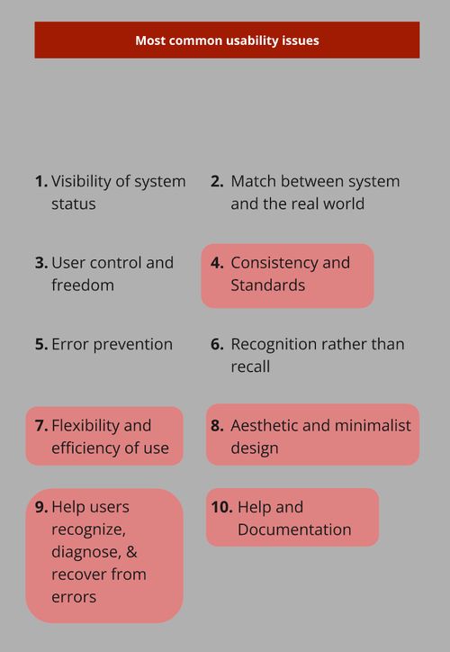
1. Heuristic evaluation
Referring to Nielsen's 10 usability heuristics, we were
spotting UX problems before users ever do. Screen by screen,
flow by flow, we combed through the Reddit app. What we found
surprised us: 27 usability issues, each rated
on Jakob Nielsen's severity scale. Five areas stood out
as the most impactful:
- Consistency and standards
- Aesthetics
- Flexibility and efficiency of use
- User control and freedom
- Help and documentation
After collecting all the information, we found that many usability issues violated multiple heuristics. While some may appear to be low severity, certain features were unnecessarily complex, which could unintentionally overwhelm users over time.
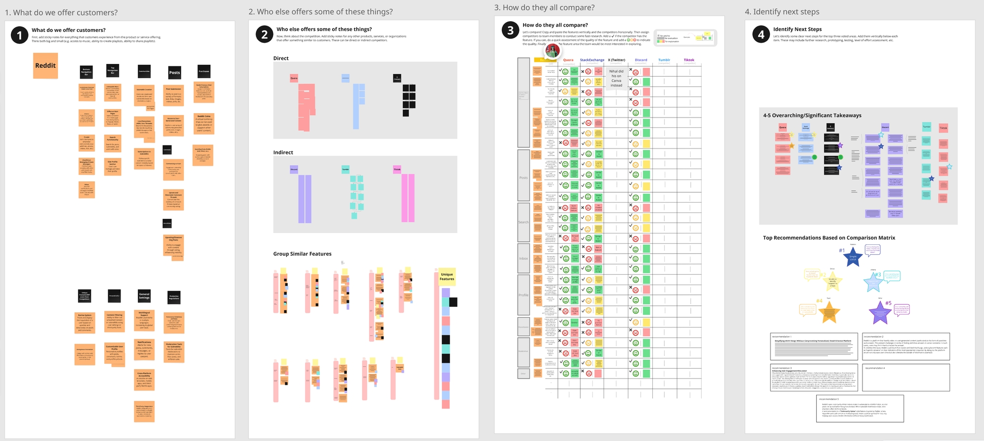
2. Competitive analysis
By comparing Reddit to other popular platforms with similar
features, we identified both unique features Reddit offers and
potential additions it could adopt. Our analysis included three
direct competitors: Quora, Stack Exchange, and X (Twitter), and three indirect ones: Discord, Tumblr, and TikTok. The question: What does Reddit do well that others don't?
And where are others doing it better?
The verdict? Reddit remains a powerhouse for community-driven content,
serving a wildly diverse range of interests. But
its UI and flows lag behind. Navigation feels heavier. Key actions
take more effort. And there's
clear room to grow, especially in how users manage
content and stay engaged without feeling overwhelmed.
3. Usability testing
3.1 Screener
Before we could test, we had to decide who to test with. With limited time and resources, we narrowed down to 18–35 year olds, Reddit's core demographic. But we didn't want just one type of user. We split participants into two groups: people who'd used Reddit for at least 6 months, and people who'd never used it but knew what it was. Because power users and newcomers experience the app completely differently. Watching both navigate the same tasks gave us a clearer picture of where the real friction lives.
Screener script
3.2 Interviews
6 tasks. 5 participants. 45 minutes each. I took on the role of note taker and observer, while my teammate facilitated. We recorded the session and took notes to capture the participants' thoughts and behaviors. After each run, we debriefed, comparing what we saw and what surprised us. At the end, participants completed the SUS (System Usability Scale) questionnaire so we could quantify what we'd observed qualitatively. The numbers and the stories together told the full picture.
Interview notes and affinity diagram
4. Final Report
When I ran the numbers, the average SUS score came out to
74, not terrible but not great either.
The tests told us what we suspected: the app works, but it doesn't
shine.The real story came from the sessions. Yes, most participants
finished the tasks, eventually. But the journey was bumpy. Small hiccups
piled up, mainly in 4 areas:
1. Browsing works, creating doesn't
Everyone could find content, whether via Google or in-app search. But Reddit-specific actions, such as awarding badges, creating communities, tripped people up. More than once we heard the same sentiment: "This feels like it's for more skilled users." The gap between consuming and contributing is too wide.
2. Too much stuff, all at once
Search feels heavier than on other platforms. Content floods in without enough structure. Participants found themselves clicking through more screens than they expected just to land on the right thread. And the endless scroll of community topics? More noise than signal.
3. Terminology that doesn't travel
What's the difference between "reply" and "join a conversation"? What exactly does "upvote" or "awards" mean to a newcomer? Reddit has its own language that not a lot of people understand. Users resorted to trial and error instead of feeling guided.
4. Hidden affordances, unclear feedback
Some functions are not clear, such as collapsing and expanding comments; adding the moderator rules are just breaking the whole flow of creating the commnuity; and error messages are never clear to the participants.
Final report
5. What I learned from this experience
1. Our assumptions will surprise us.
I went in expecting certain tasks to be nightmares. But some users were able to learn it much faster than we thought; others don't even face that issue. Research reminds you that you're not the user; watching real people is the only way to know.
2. Pilot testing is non-negotiable.
We ran pilots before the real sessions. And many small things went wrong. A prompt that confused people. A flow that broke the rhythm. Every pilot surfaced something we'd have missed. It would have cost us sessions and trust if we'd skipped it.
3. 5 participants reveal A LOT. More would be better.
With just 5 people, we uncovered plenty isseus, including unexpected bugs and behaviors we hadn't anticipated. But research is never "done." More participants would have given us stronger patterns and confidence. For this project, 5 was enough to act on, but for production, we should aim for more.
6. Supplemental Materials
Heuristic evaluation Competitive analysis Screener Post-Test questions Usability testing plan Usability testing affinity diagram