Trusty
Your Guide to Credible News.
Project Overview
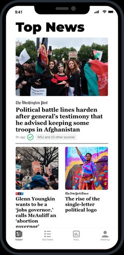
A mobile app designed to help users easily verify the credibility of news. With a user-friendly interface, it allows users to filter out misinformation from social media at the app level. Trusty provides convenient visual cues for assessing news credibility and lets users choose their trusted news sources for a cleaner, smoother experience. This project was created during the 2021 Adobe Creative Jam, where we were delighted to receive an honorable mention, ranking in the top 20 out of 315 competitors.
Design Process
1. Research
To guide our design process, we conducted an in-depth analysis of major mobile news apps, including Apple News and The New York Times. We identified key elements for building a serious and unbiased news platform - a neutral, clean, and transparent user interface. These principles shaped the core of our app's design. Despite the strict time constraints of the Creative Jam, which limited our ability to conduct surveys, we focused on leveraging these insights to create a reliable user experience.
2. Design
2.1 Branding
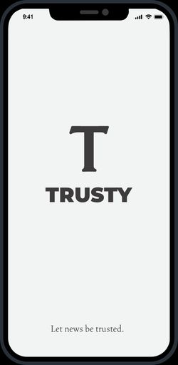
We began our design process by focusing on the branding. Our goal was to create an app that feels neutral yet inviting, so we opted for a color palette of dark gray and creamy white. For the logo, we chose a simple serif letter “T” to convey a formal and trustworthy tone. This font choice was also intended to evoke the classic feel of the print in newspaper media, reminiscent of the typeface used by The New York Times, reinforcing the app's commitment to reliable and credible information.
2.2 Design System
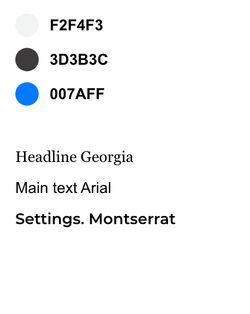
With branding completed, we turned our attention to finding a simplistic solution for user engagement with the app. We opted for a near-black font on a near-white background, similar to the aesthetic of Apple News. This choice aims to create a cleaner appearance while ensuring the information presented is serious and credible. Our action color is blue, which serves as a neutral tone for users to process information. Additionally, to signal different statuses, we chose green and red to represent “verified” and “not verified,” respectively, as these colors are widely recognized in the mainstream society. For typography, we selected Georgia for headlines to establish a formal tone, while Arial serves as our main text for optimal readability and compatibility. Finally, we opted for Montserrat as the system font, providing a bold and modern look that complements the overall design without conflicting with the main content of the news app.

3. User Flow
3.1 Understanding User Intent
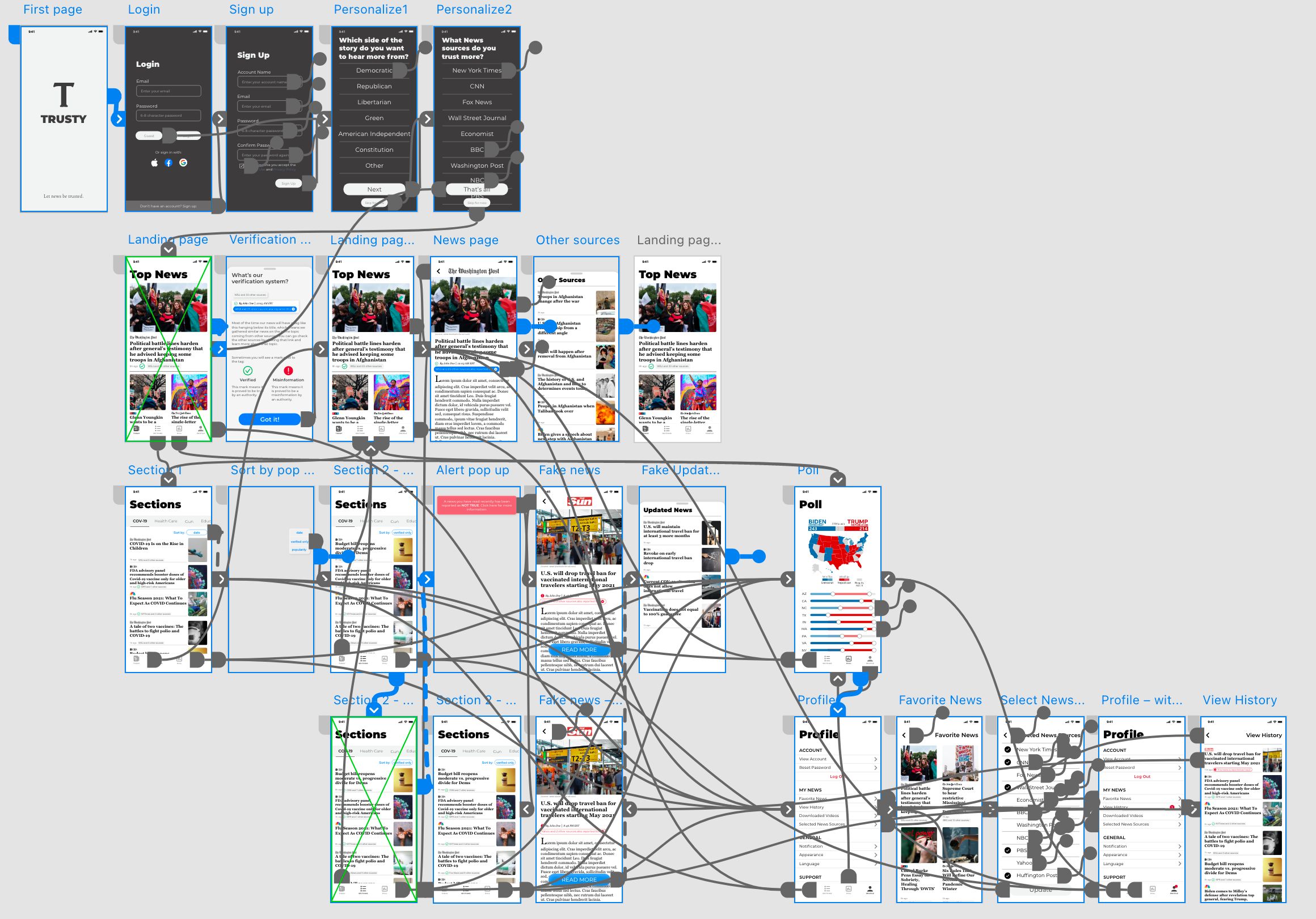
To design our product, we focused on the user's mindset while engaging with a news app. We recognized that first-time users typically seek to establish source preferences and understand how the app operates.
3.2 Onboarding Experience
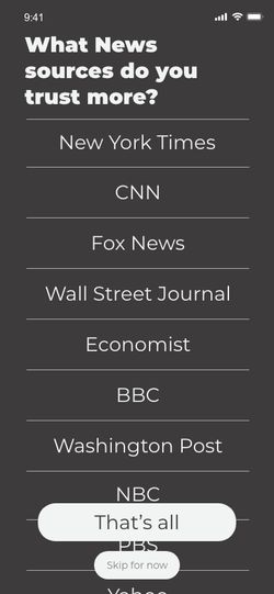
Upon launching the app for the first time, users are presented with an option to select their preferred news categories and sources. This personalized onboarding ensures that users can curate their news feed according to their interests.
3.3 Home Page Introduction
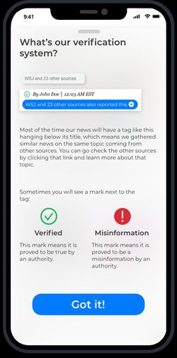
Once users land on the home page, we provide an overview of our verification system, clearly outlining how we gather and assess information. This transparency fosters trust and sets the stage for user engagement.
3.4 News Verification Indication & Accessing Additional Sources
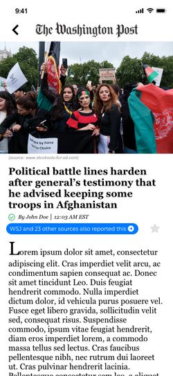
As users begin to interact with the app, we enhance their experience by offering clear verification indicators for each piece of news. Verified news will feature a green checkmark below the headline, while debunked news will display a red “X.” This visual cue allows users to quickly assess the credibility of the information.Each news item includes a link that directs users to additional sources reporting the same information. This feature empowers users to independently verify the credibility of news articles, especially when they question the accuracy of the information presented.3.5 Handling Misinformation
In cases where a news article is proven to be misinformation, we send a notification to users who have previously engaged with that article. This timely alert ensures that users stay informed about updates. Additionally, we provide links to related articles discussing the misinformation, enabling users to access accurate and updated information seamlessly.
Click this link to try out the prototype: Adobe XD Prototype
4. Feedback
After submitting our design, we received significant attention during the showcase at the end of the Jam. While we didn't have comprehensive user feedback, we learned valuable insights, such as the potential for incorporating more color, increasing font size and weight for better readability, and following accessibility standards for whitespace and spacing. Due to the tight timeline, we couldn't fully develop a more detailed user flow or simulate real-world scenarios in our outcomes. We also gained inspiration from other teams, whose diverse approaches encouraged us to refine our process and create a prototype that is both more accessible and innovative.
Go back to the home page