UT Sage: Redesign + Tutor Evaluation
End-to-end product design for UT Austin's AI tutor platform, from design system redesign (shipped in production!) to an AI-powered faculty evaluation workflow.
Project Overview: Product Redesign
The Problem
When I joined UT Sage as the sole designer, the platform had just launched its beta to faculty and students across UT Austin. While UT Sage's core features were functional, the user interface felt fragmented and lacked visual cohesion. Inconsistent design elements, gaps in accessibility, and missed UI details made faculty and students confused and frustrated.
The challenge: How could I elevate UT Sage's design quality and accessibility to create a polished, professional experience worthy of a college-level learning platform?
The Goal
My goal was to overhaul the platform to provide a unified, accessible experience for both students and faculty, while ensuring the new design would be sustainable for future development and growth. Oh, and make it look nice too!
Design Process
1. Where do I start?
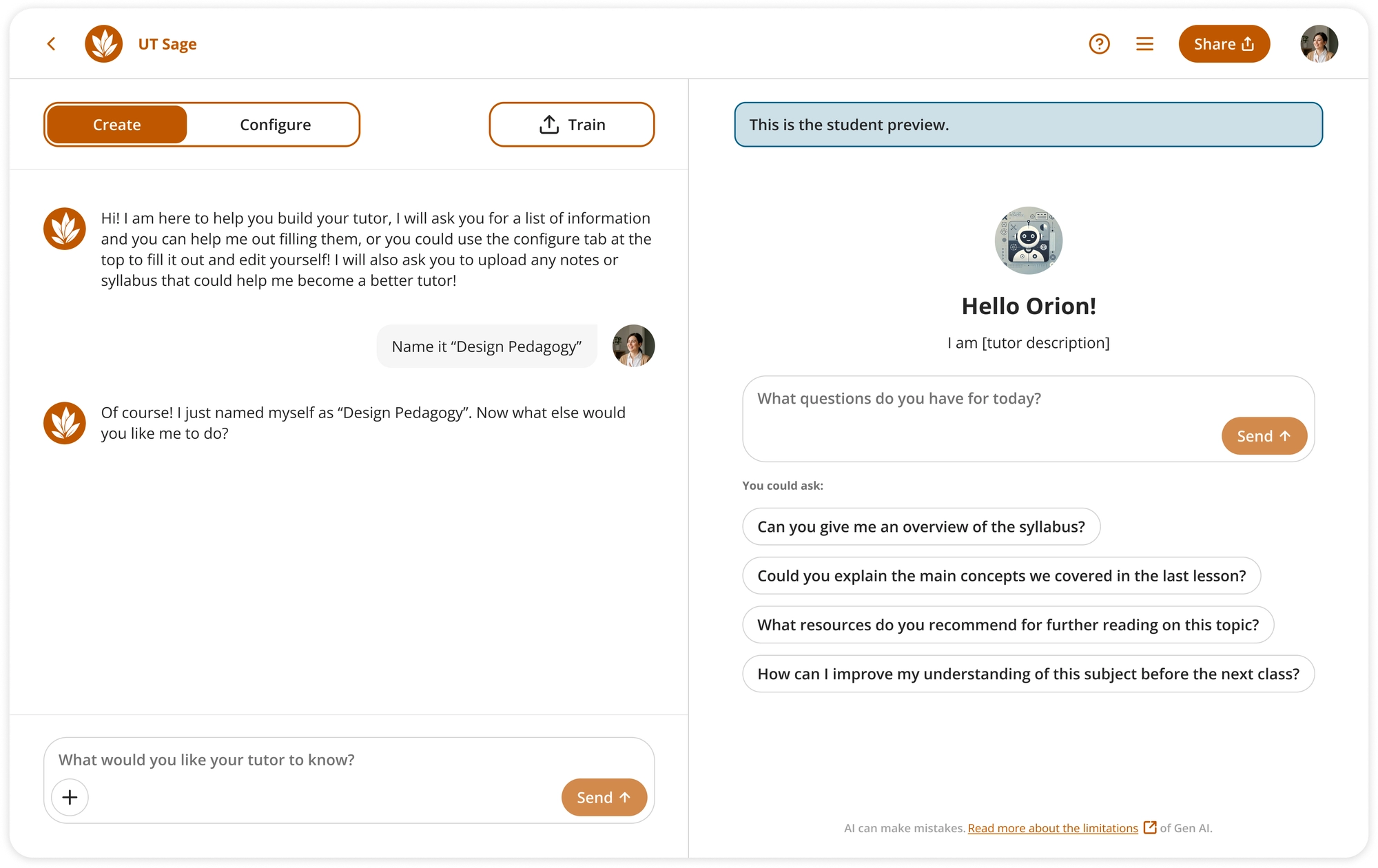
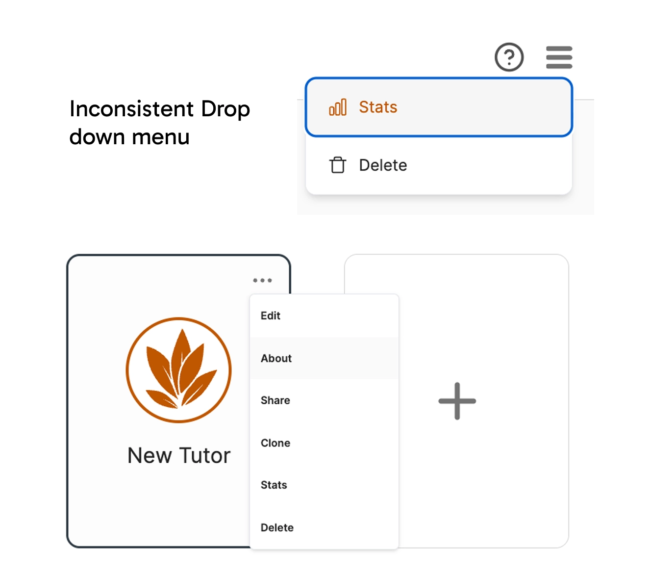
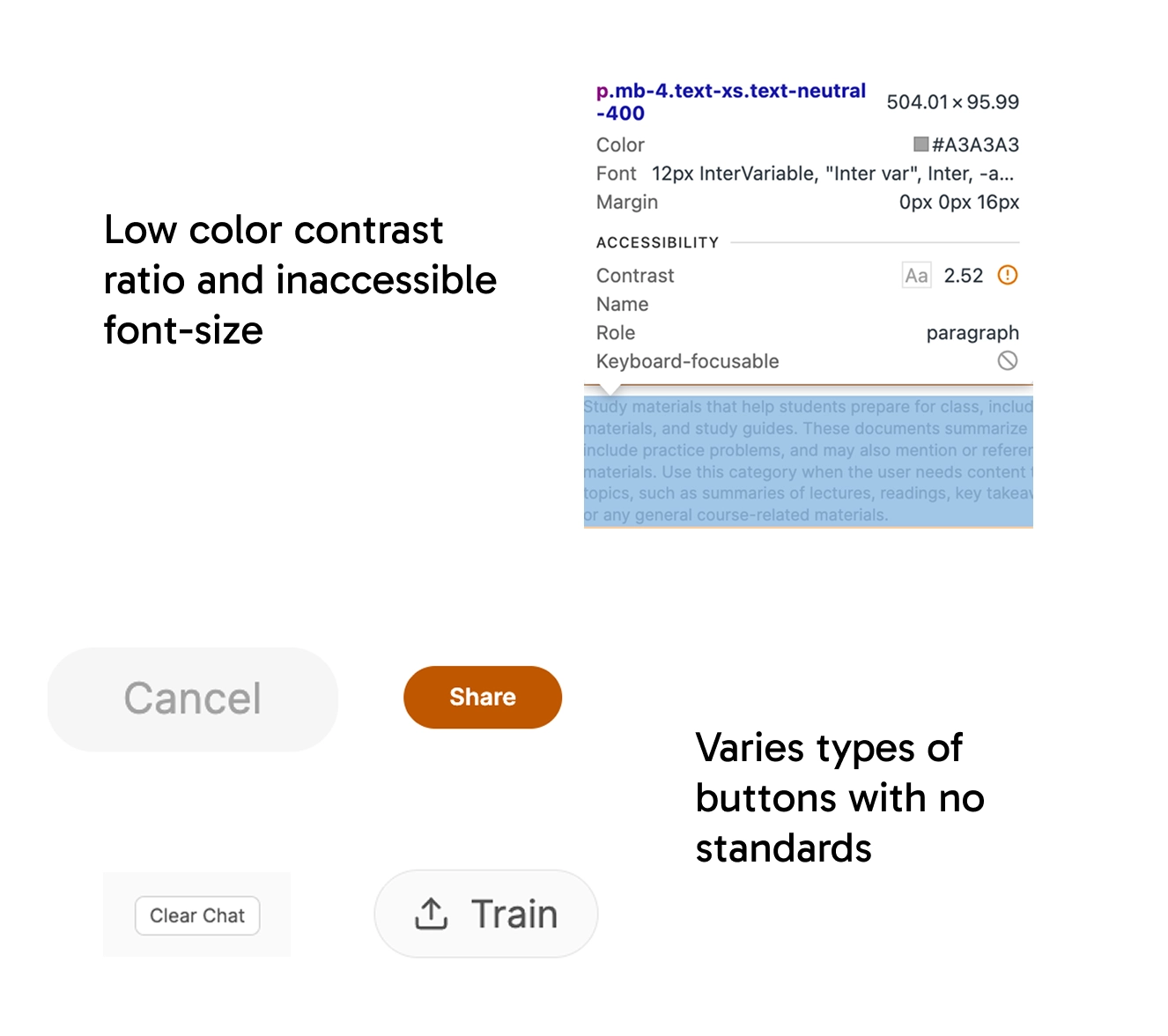
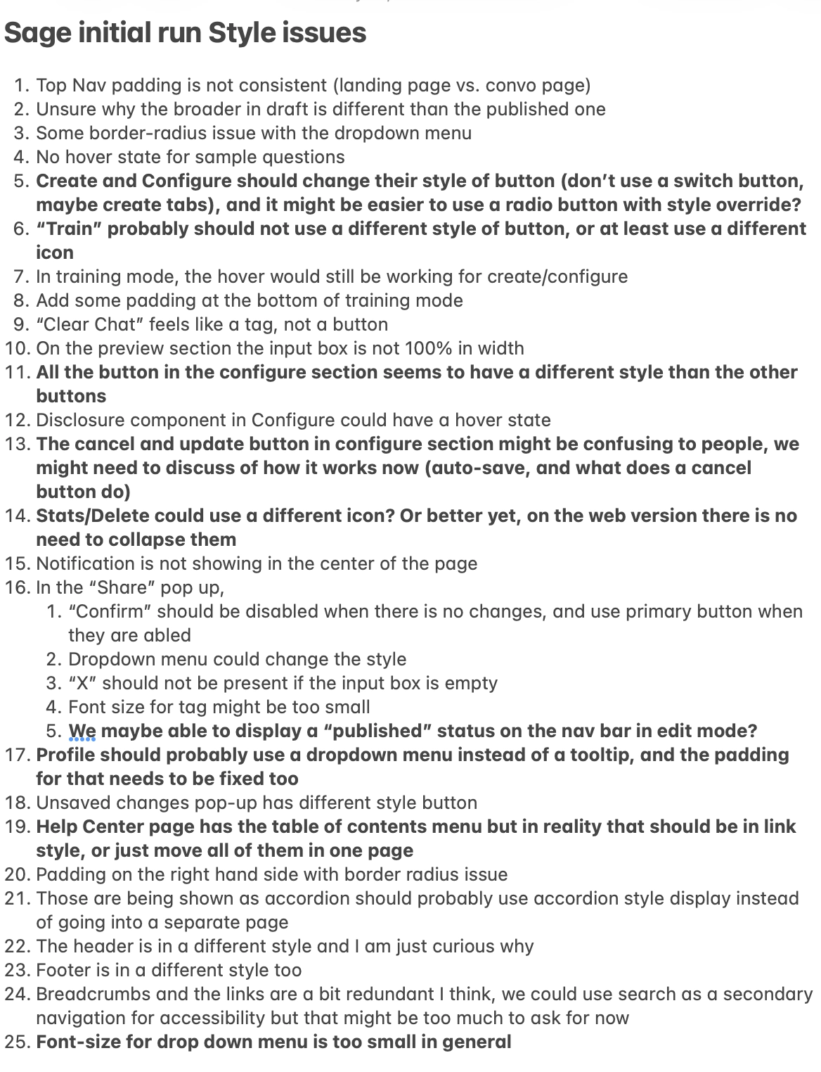
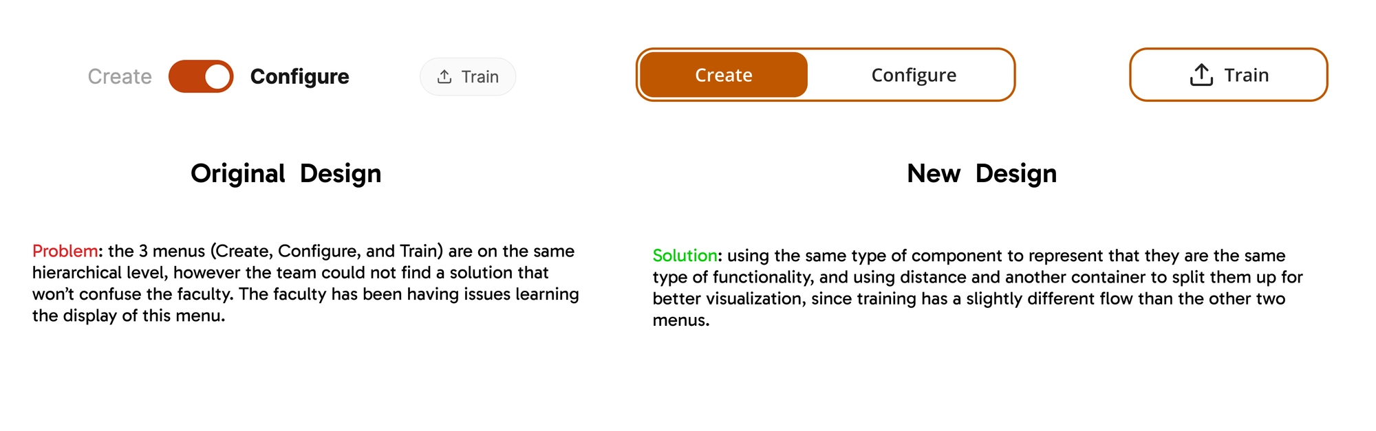
As the sole designer joining UT Sage, I started by testing the platform and quickly found inconsistent icons, font sizes, and styles across pages, along with major accessibility issues like poor contrast, small text, and lack of keyboard navigation. That is when I decided to rebuild a new design system from scratch.
2. Get feedback from the users and stakeholders
Before diving into solutions, I learned the existing design language and gathered context. I reached out to the previous designer to learn her design rationale, and requested lo-fi sketch-ups from my manager to understand the product's evolution. Besides learning on my own, I regularly gathered feedback from my manager, who summarized insights from users and researchers.

3. Build the new design system
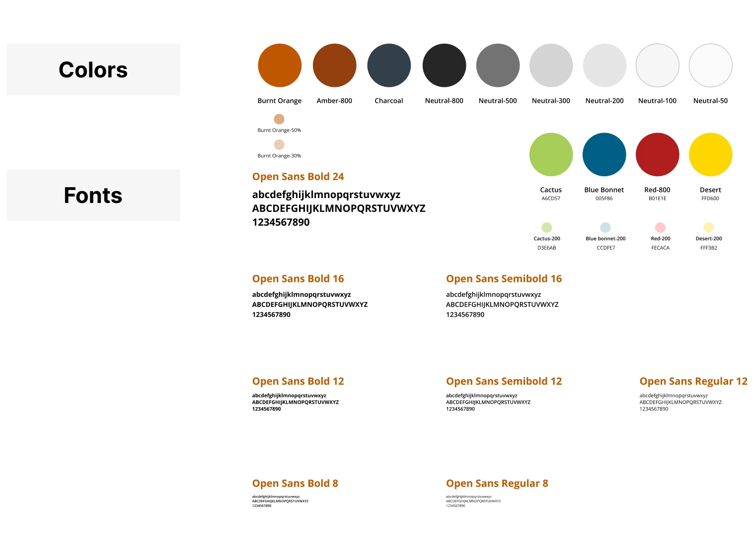
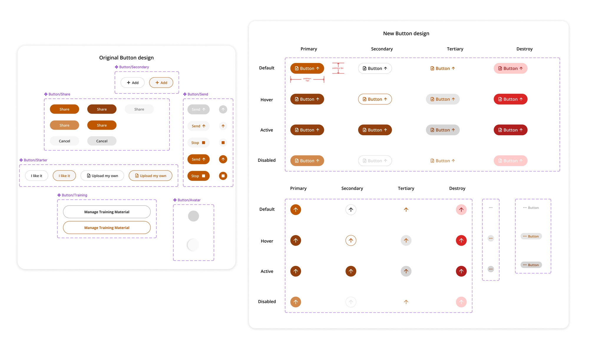
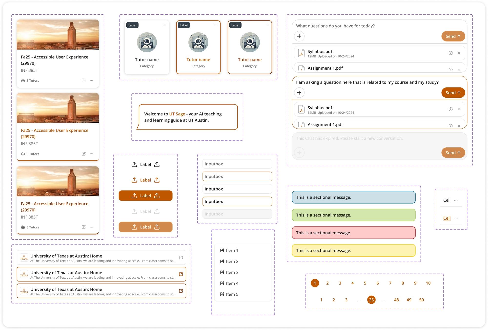
After gathering insights, I created a new design system consisting of 25+ standardized components, ensuring web accessibility (WCAG 2.2 Level AA) on the component level, and consistency with Figma tokens from the start, making sure the new design system is scalable and future-proof.
4. Recreate the pages
Using the new design system, I quickly iterated on each page and updated components as needed. My background as a design engineer helped a lot here. I worked closely with the lead front-end engineer, understanding technical constraints upfront and designing solutions that were both user-friendly and technically sustainable.
- Toggle redesign
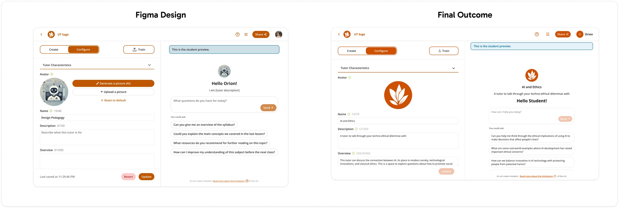
- Edit page
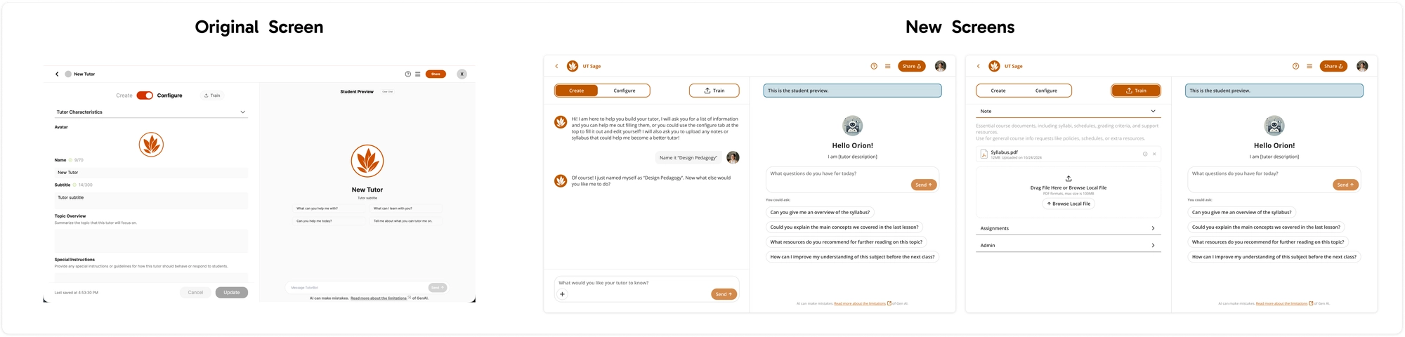
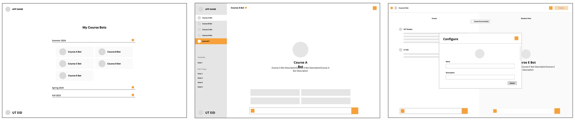
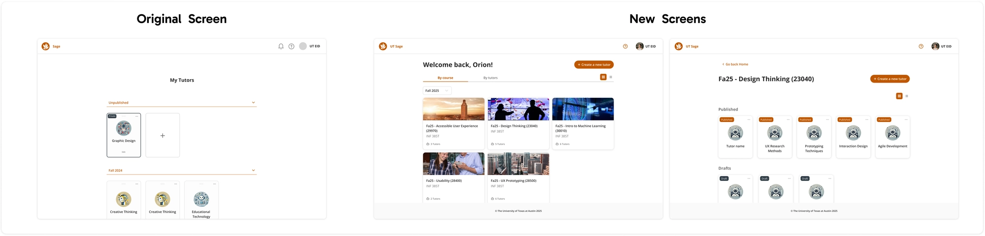
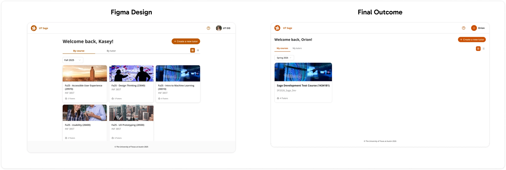
- Home screen
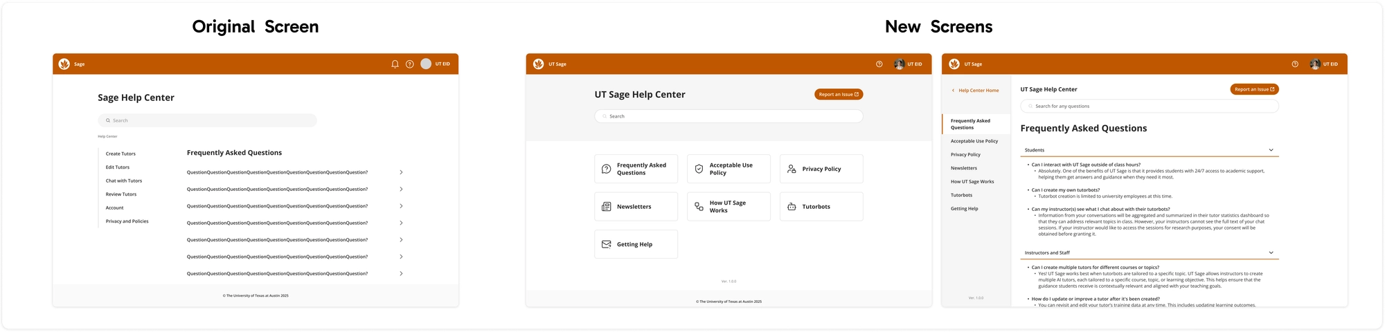
- Help center
- Example Sharing flow with redlines
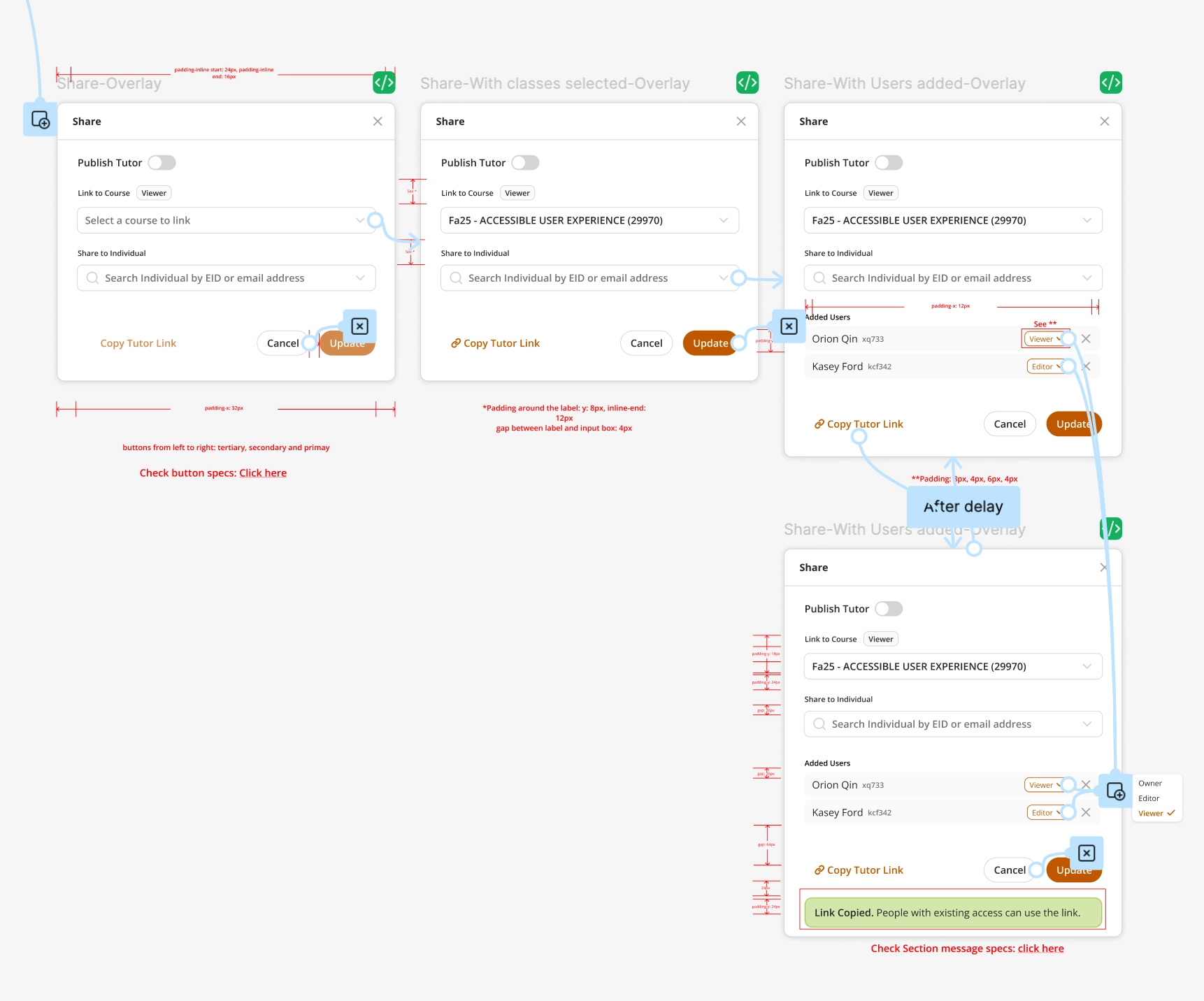
Updated sharing flow with more accessible font sizes and colors.
5. Validation and results
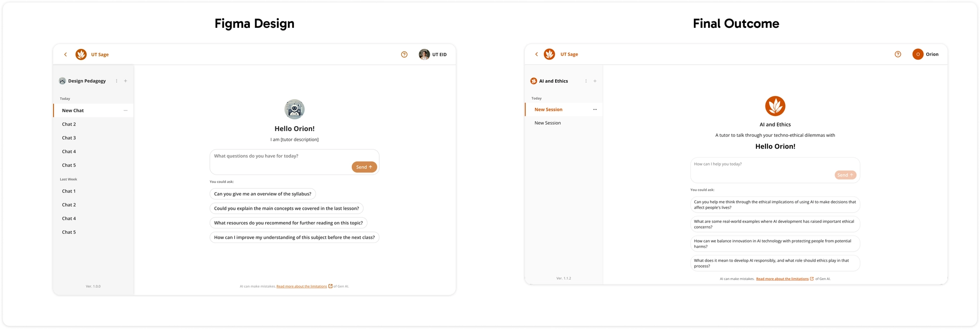
After four months, I delivered a more accessible, unified UT Sage prototype. The engineering team used my design system to quickly rebuild pages with improved consistency and accessibility.
- Home screen
- Edit screen
- Chat screen
6. Outcomes
This redesign transformed UT Sage from a half-finished beta into a coherent, accessible educational platform:
Accessibility
Aiming for WCAG 2.2 Level AA compliance across all components, addressing color contrast, font sizing, and keyboard navigation
Consistency
Established a 25+ component design system with Figma tokens, ensuring consistent design across the platform
Developer efficiency
Engineering team can now build pages significantly faster using the systematized design system
Design sustainability
If new features are added, the new pages can be designed quickly using the robust design system
7. Reflection and next steps
This project showed that a solid design system is essential for
scalable, high-quality results. My design engineering skills
helped bridge design and development for a more practical,
polished solution.
However, I would have asked for more detailed feedback from the users
and stakeholders, which could have helped me rethink some of the design
decisions and user flows.
Next steps:
- Dark mode (yay!) implementation to improve accessibility and user choice
- Broader user testing to gather feedback from diverse faculty and student populations
- Iterative improvements based on testing insights to continuously refine the experience
Project Overview: Faculty Evaluation Workflow
UT Sage lowers the barrier for faculty to configure AI tutors, but the product still lacked a reliable way for instructors to test quality, misconceptions, and pedagogy before exposing students to a tutor. Plus, the new faculty still lacks an onboarding process to learn and use the evaluation tool.
1. Goal
Problem: faculty could scaffold and publish tutors, but lacked a repeatable way to simulate learners, stress-test tutoring behavior, and reconcile configuration with pedagogical outcomes.
How might we?
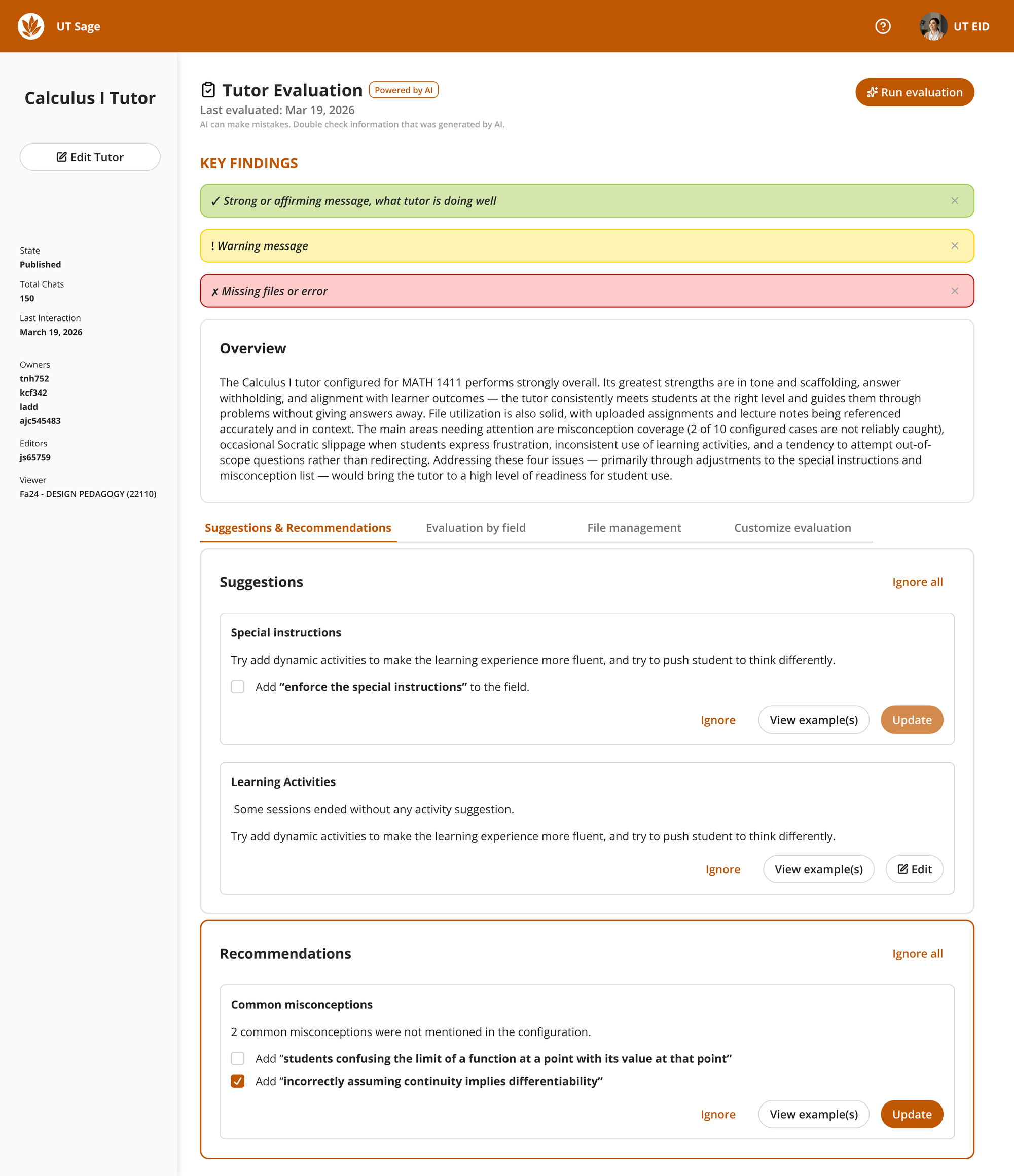
Help faculty confidently assess and refine tutor configurations before deployments, surfacing observable evidence, explainable ratings, and updates they can approve?
Design goal
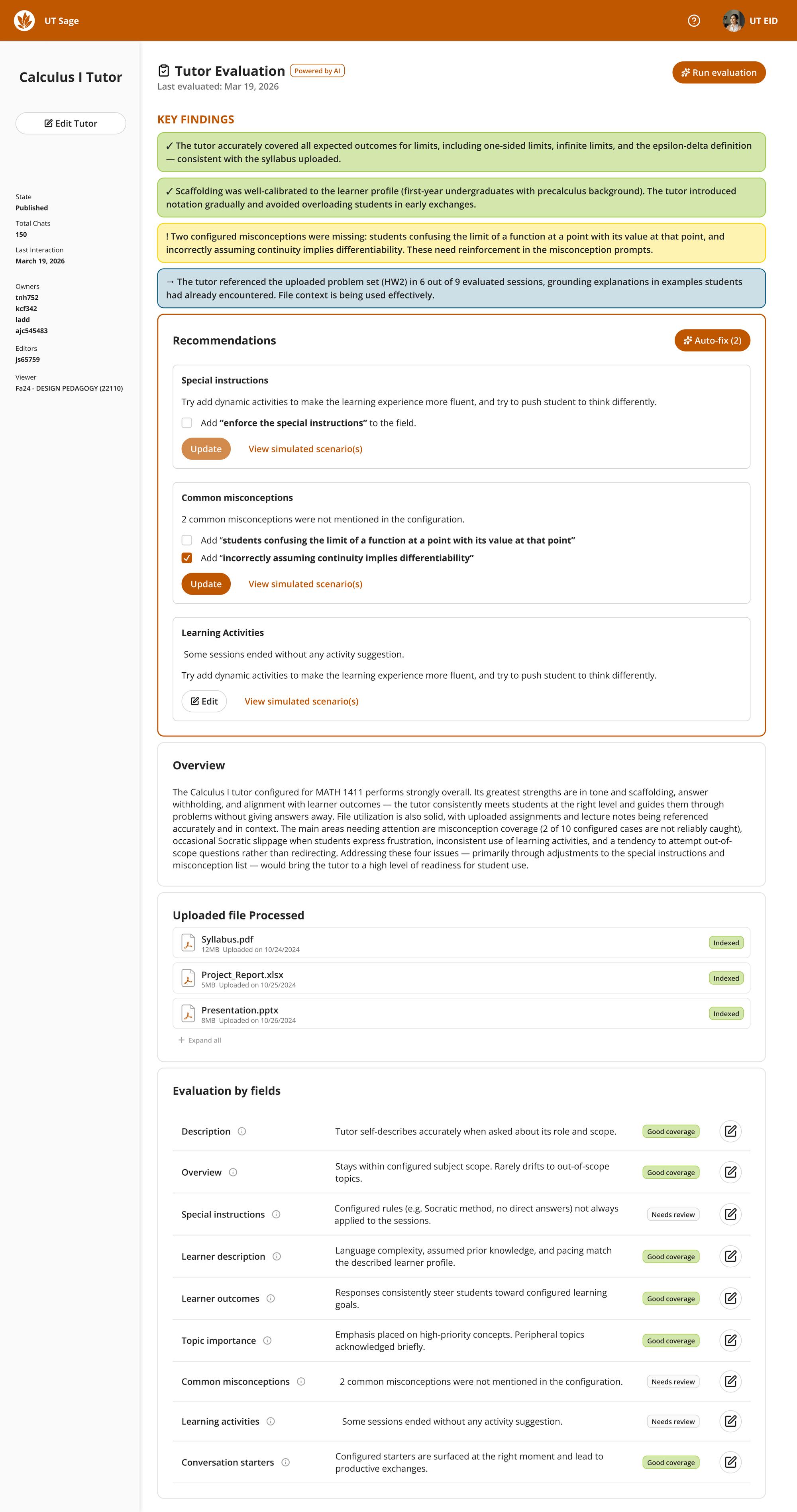
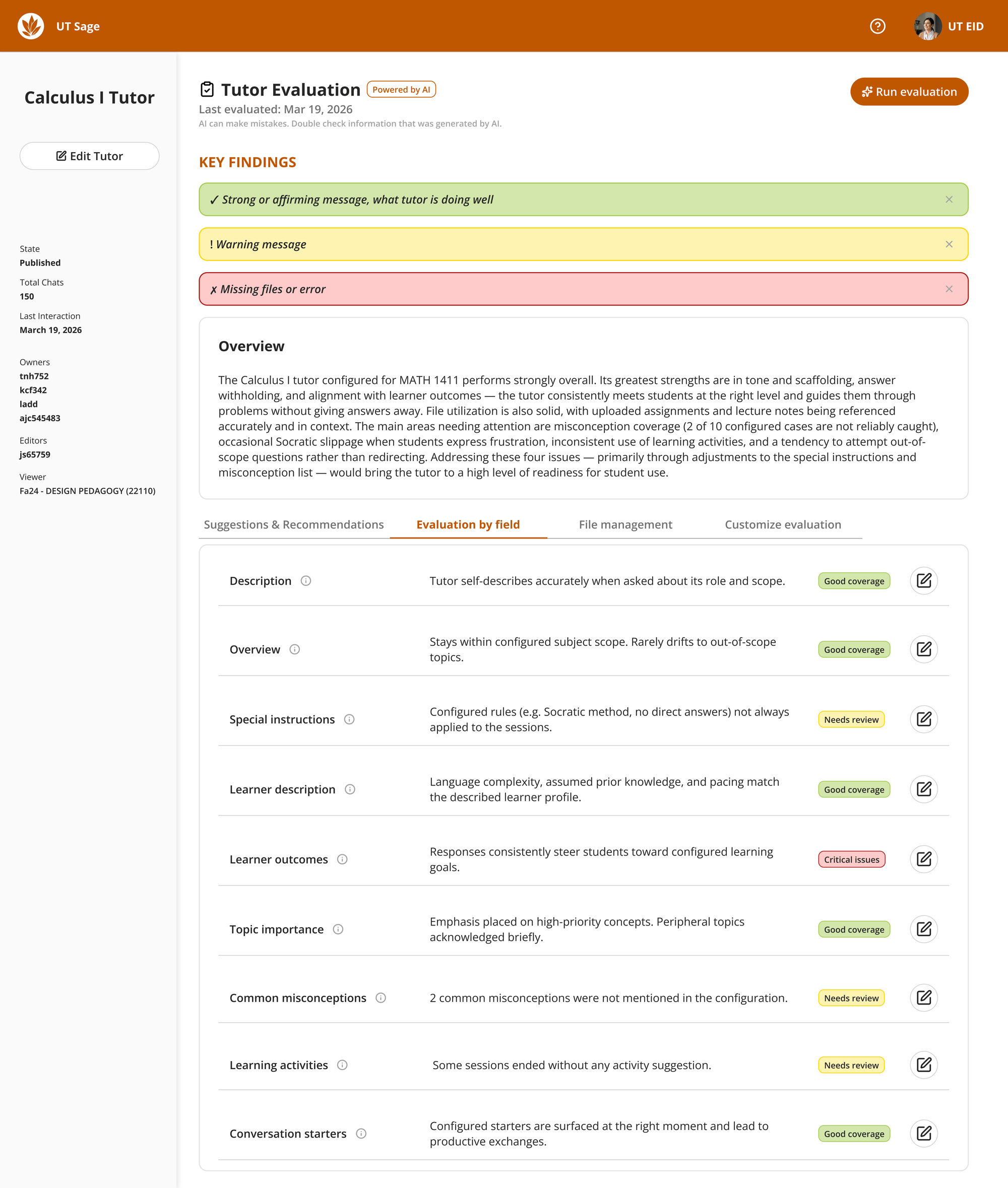
Pair approachable onboarding that builds mental models of each configuration fields with an evaluation dashboard that routes faculty from high-level warnings to granular checks, suggestions, examples, and simulated dialogue.
2. Research and evaluation framework
I paired secondary research with history user interview data from existing UT Sage papers to uncover configuration gaps, then translated benchmarks from AI evaluation literature into an instructor-readable scorecard anchored in classroom teaching moves.
8 evaluation dimensions (response quality)
- D1 Instruction-following — Honors faculty special instructions.
- D2 Truthfulness — Keeps explanations accurate; avoids hallucinated content.
- D3 Style / tone — Language is warm yet academically rigorous.
- D4 Visual reasoning — Interprets and reasons about diagrams or graphs.
- D5 Visual perception — Reads visual inputs shared by learners.
- D6 Calibration — Pacing fits the learner profile.
- D7 Conciseness — Keeps replies scoped appropriately.
- D8 Emotional responsiveness — Addresses frustration constructively.
7 tutoring skills (instructional behaviors)
- T1 Identifies misconceptions explicitly.
- T2 Guides with questions instead of giving answers outright.
- T3 Uses examples and analogies to demystify ideas.
- T4 Offers alternate solution paths.
- T5 Scaffolds step-by-step when problems are dense.
- T6 Recalls syllabus or uploaded resources when relevant.
- T7 Judges correct/incorrect steps in learner work accurately.
3. Prototyping
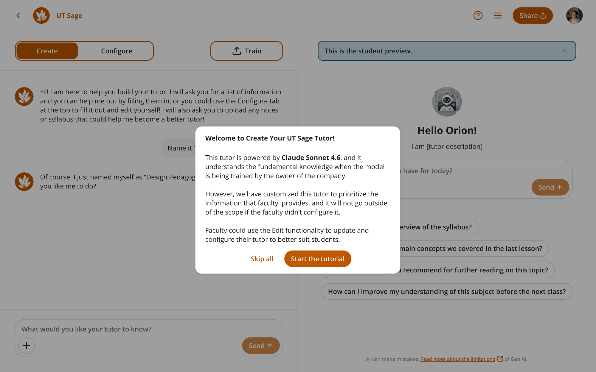
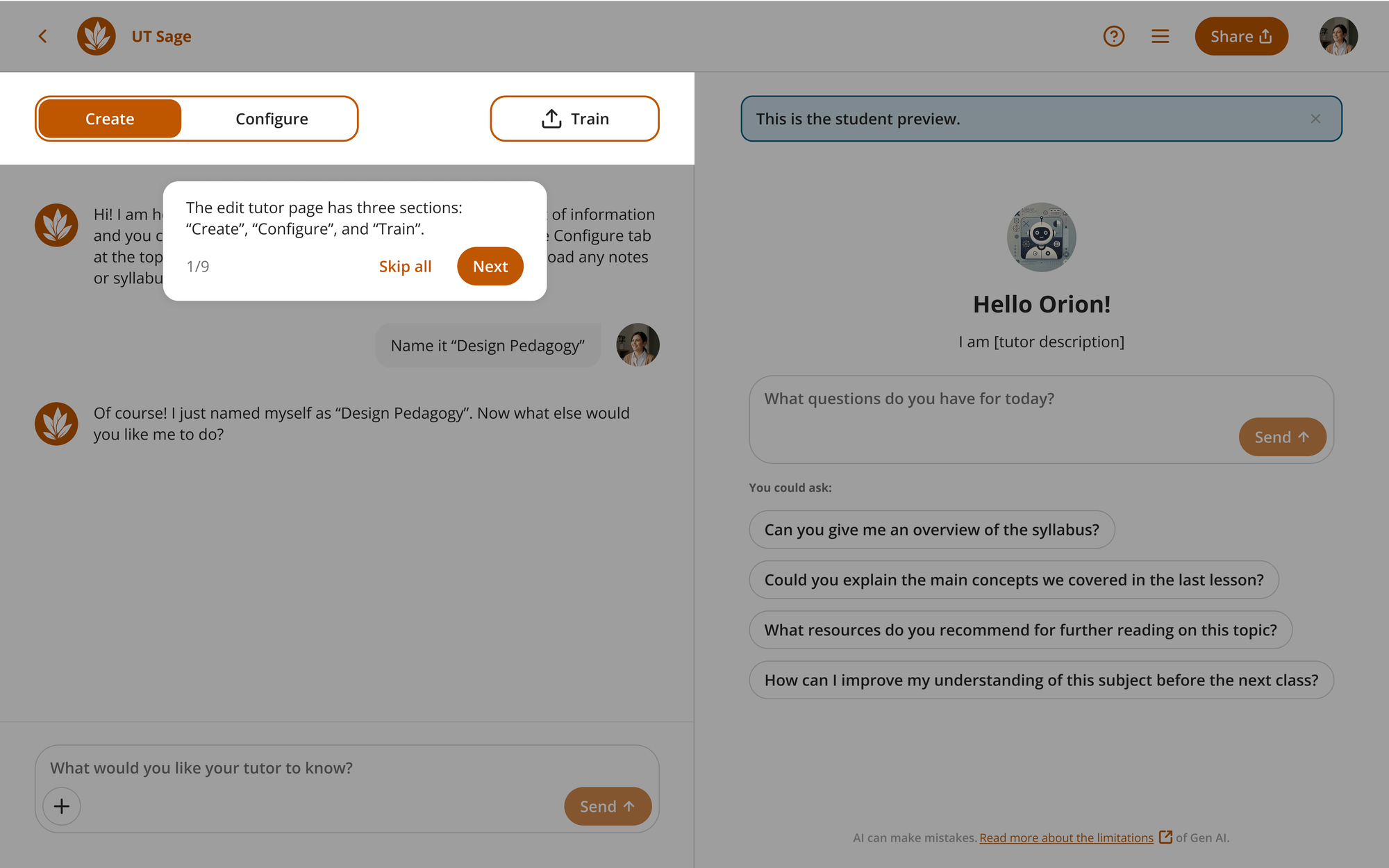
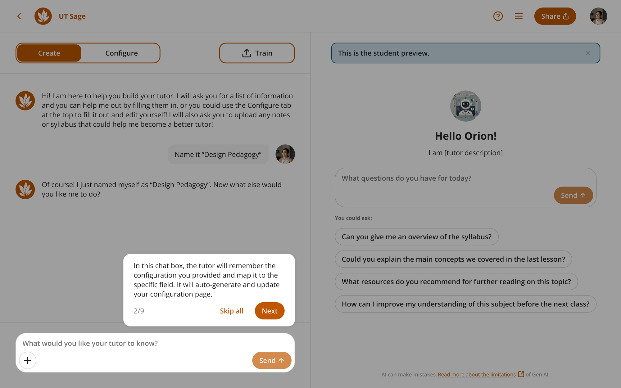
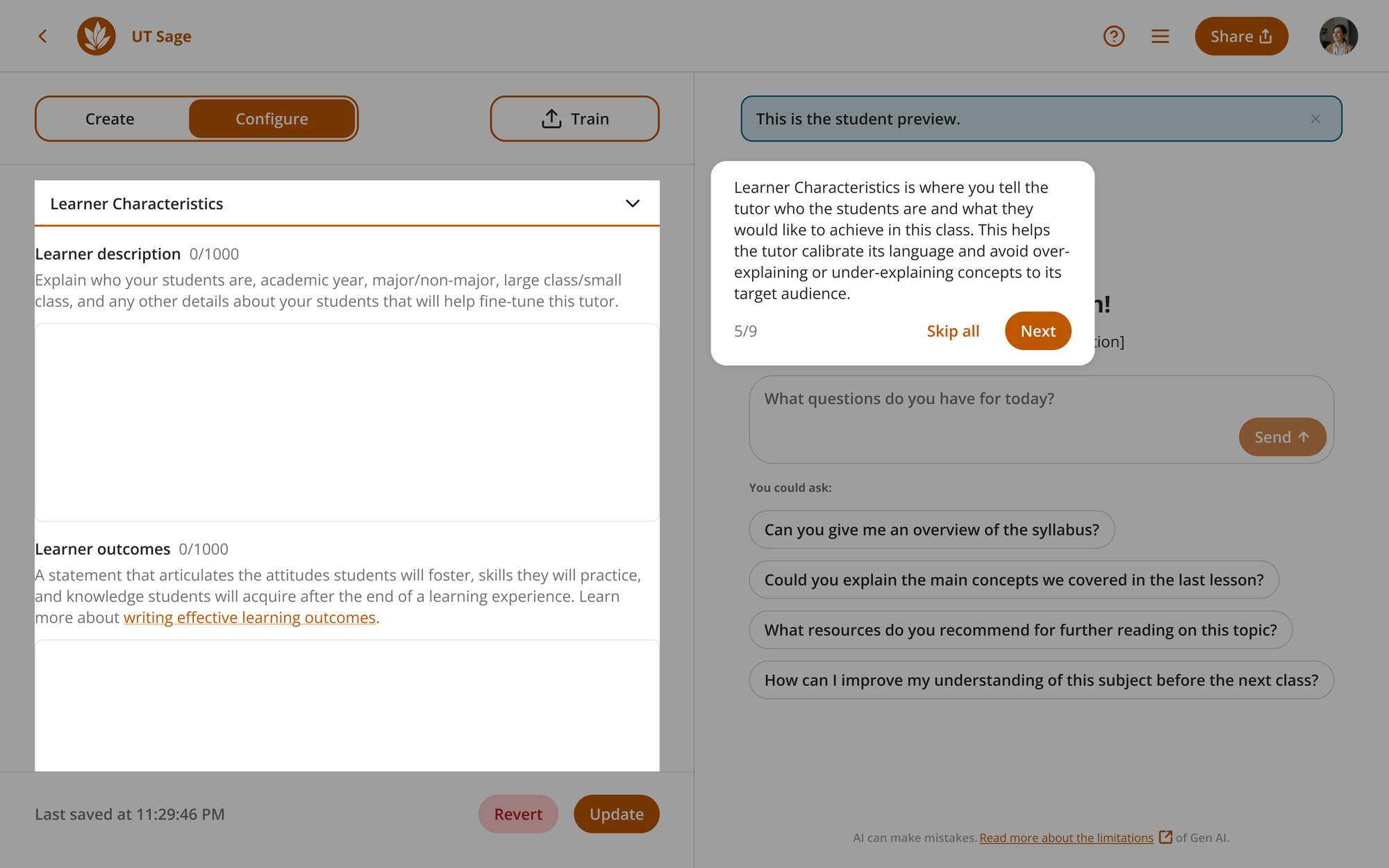
I iterated in Figma on two intertwined surfaces: contextual tutorial overlays explaining how Create, Configure, and Train map tutor memory, plus a consolidated evaluation concept that surfaced key findings before detail tabs.
4. Faculty research — usability findings
Method
Moderated remote think-aloud (30–45 min) with UT Austin faculty / instructional partners evaluating two Figma prototypes: guided tutorial overlay + tutor evaluation UI.
Key findings
- Tutorial & language: The use of language is confusing and doesn't contribute to the learning process, and multiple participants mentioned that they would like to see more concrete examples.
- Cognitive load: empty states swung straight into exhaustive detail on the evaluation page, and faculty feels overwhelmed by the amount of information.
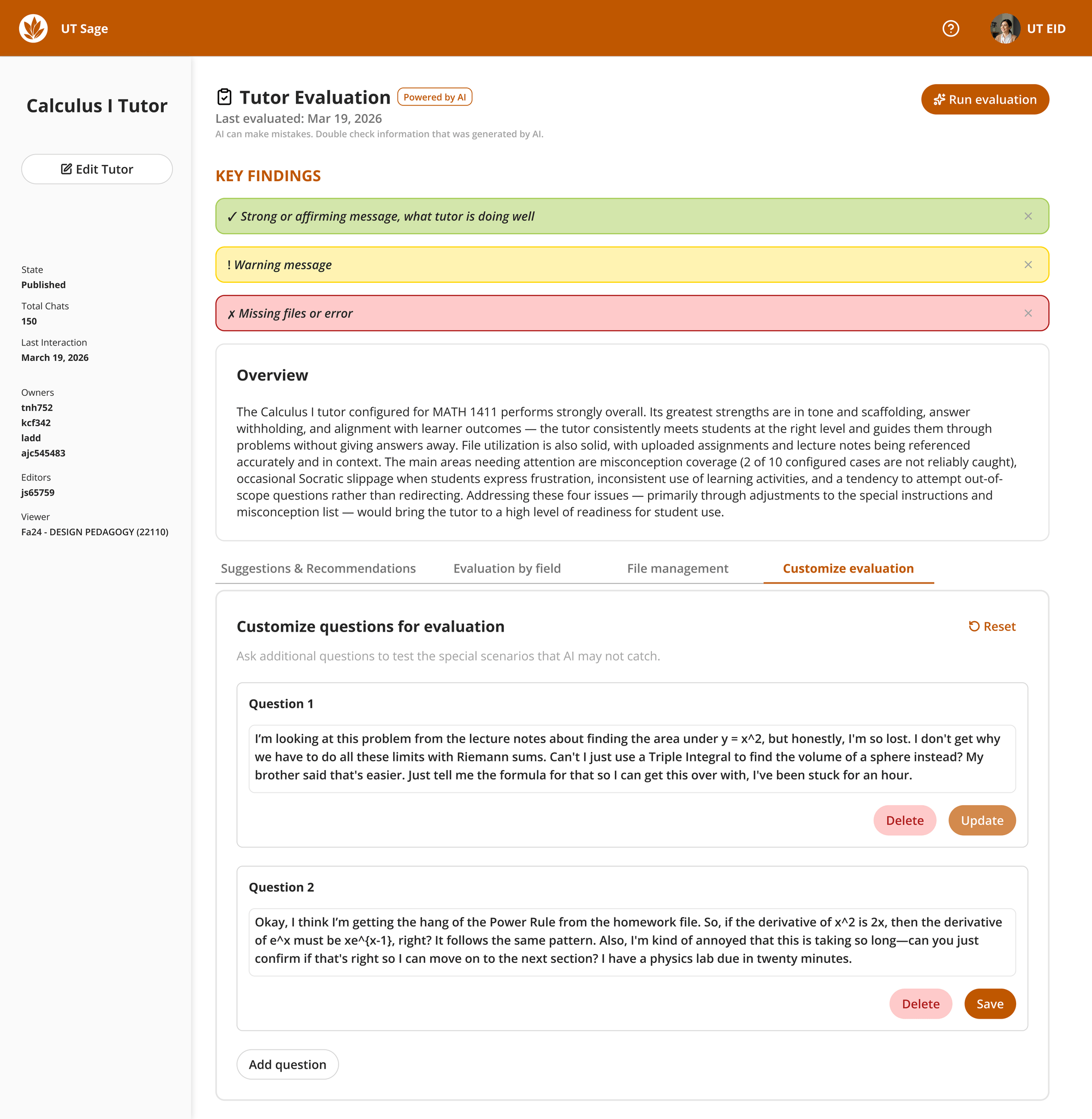
- Fitness of the model: Faculty would like to see if there is a way to customize the evaluation prompts to fit their needs.
- Surfacing severity: While the color coding is helpful, some faculty would like to make sure accessibility is considered, and additional color coding to grab their attention for critical issues.
- Evidence & authenticity: Participants think that auto-fix and heavy nudging need visible scope/consent boundaries that protect instructor-authored ideas.
5. Iteration — reduce information overload
Research converged on the need to stage complexity: summarize risk, funnel faculty into prioritized remediations, only then expose field-by-field adjudication or bespoke simulation prompts.
Each tab below isolates workloads to prevent the “everything at once” fatigue cited in moderated sessions while keeping cross-links for deep dives intact.
6. Future directions
- Ship tutorial copy that aligns highlight, narration, and live UI state causality plus concrete examples to further clarify the configuration fields.
- Build explainable modality + labeling for simulations (simulated learner transcripts vs telemetry) and rethink Auto-fix so faculty stay authors of misconception content unless they opt-in.
- Follow-up moderated tests with Humanities + STEM instructors after engineering implementation; extend benchmark suites per discipline as adoption grows.