Venus
We help you find your best matches, and we help you plan your dates.
Project Overview
We took a museum visit as a starting point: one painting sparked the concept, and we turned it into a mobile dating app that tackles a real problem. From start to finish, I led the design system in Figma, contributed feature ideas, built interactions and flows, and addressed usability issues after testing.
Dating through the app is a problem...
A lot of dating apps feel like a numbers game, and people keep swiping hoping for better matches and end up less invested in the ones they have. We wanted to shift that.
Inspired by the art, conceptualized by the team
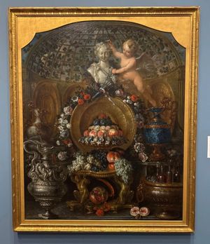
We chose Pierre Nicolas Huilliot's Still Life with Silver and Gold Vessels, Fruit, and Flowers at the Blanton Museum of Art. Venus, goddess of love, looks over the scene; Cupid stands beside her. We liked the idea of the app as Venus, guiding users to love, with Cupid as the helper that suggests matches and dates.
Our UX Prototyping Process
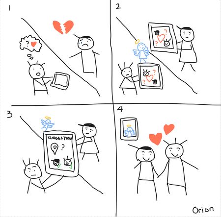
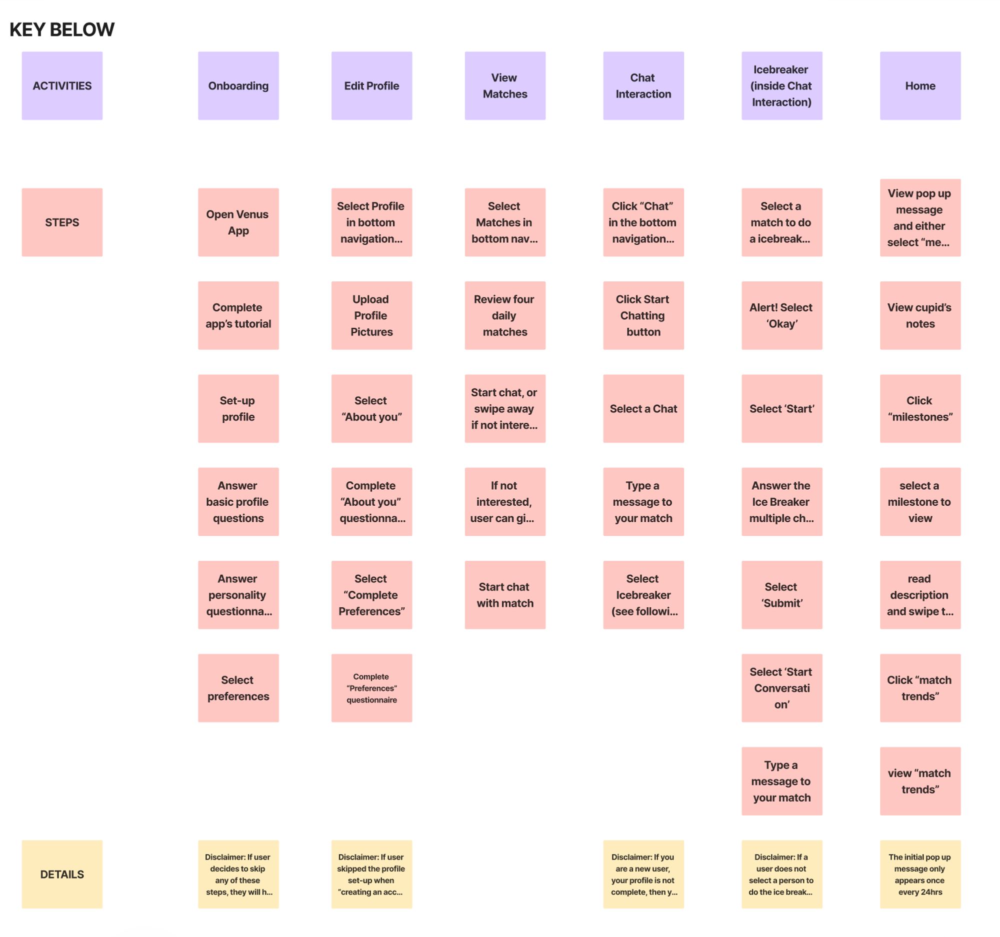
1. Storyboards and story mapping
I sketched a storyboard first: the AI assistant (Cupid) acts as matchmaker; users get hand-picked matches and can plan dates in the app. We also interviewed people about what they liked and disliked in current dating apps, built an affinity diagram, then a story map for the activities and tasks we wanted to support.
Story map
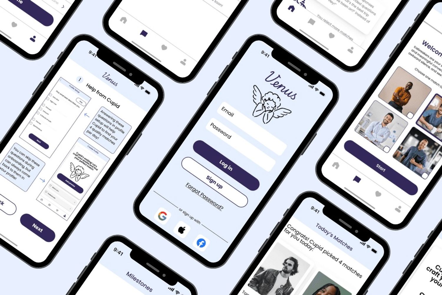
2. Low-fi & Mid-fi prototype
I created the match flow-how users see Cupid's picks and what
they can do with each match. The team covered onboarding, edit
profile, progress, and the icebreaker game.
Here is the highlight:
- Match screen
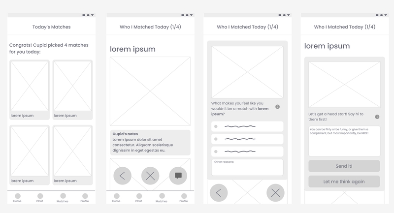
No swiping. Users open a recommended profile and choose to talk. I also added an unmatch flow, giving them a choice to select common reasons, or an open-ended option to describe why they don't want to match with this person.
- Progress screen
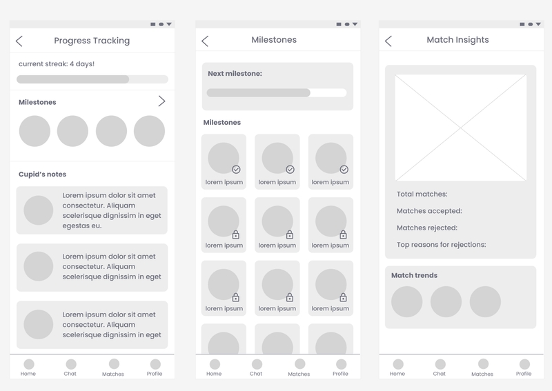
This shows how they're doing with current matches and trends in who they like.
Here are the rest of the screens:
Lo-fi and mid-fi screens
3. Making a design system
3.1 Colors and font
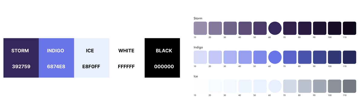
I chose to skip aggressive reds and pinks so the app didn't
feel like "love at first swipe."
Primary color: ice blue.
Action color: Storm.
Both feel calm and trustworthy and set us apart from
other dating apps.
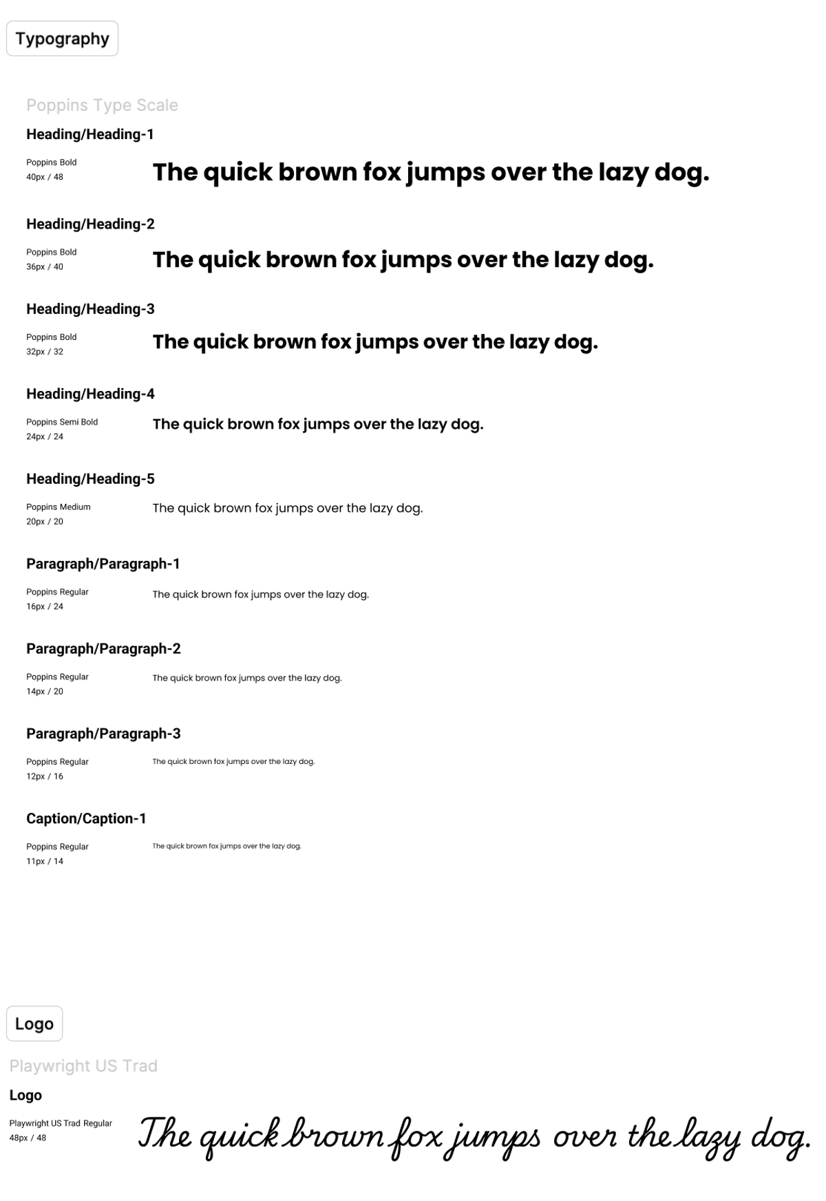
Since our app is called Venus, a classic greek mythological figure,
we wanted the display/logo font to feel classic-Playwright US Trad, and body text is Poppins for readability on small
screens.
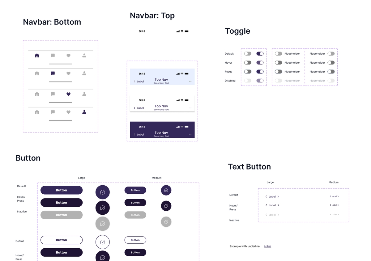
3.2 Components and the design system
A good design system is essential for a consistent and efficient design, and it is undoubtedly one of my favorite part of the design process. So I built the design system: 18+ components with consistent radius and spacing. A teammate added color variables for states (hover, active, etc.), so the hi-fi stayed consistent and we could move fast.
4. First iteration of hi-fi prototype
We brought the design system into a hi-fi prototype with microanimations and interactions.
- Onboarding
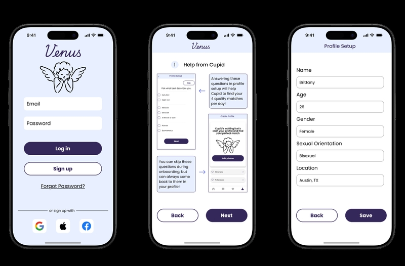
Profile setup and app mechanics. (We found issues here later in testing)
- Match screen
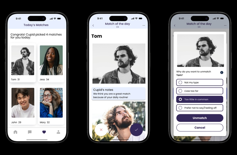
Match/Unmatch flow with reasons, options to pick why they would like to unmatch with the person.
- Chat & icebreaker screens
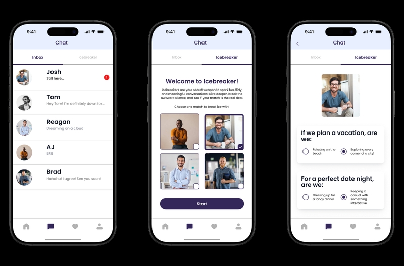
Chat screen, plus an icebreaker game so users can learn about a match before messaging.
- Home / progress
Current matches and how they're doing in the app.
Some microanimations we added:
5. Usability testing and feedback
We have to make sure that our app is not being developed in a small
dark room and is some crazy delusional product by a group of
designers, so we need to take it to the real world and let the users
to experience it.
We ran moderated testing with 7 tasks; each of us
tested 2 participants
(Ages from 22–34, mixed gender and sexuality), face-to-face. Notes and
post-task forms went into a feedback board. Then we synthesized what worked
and what didn't.
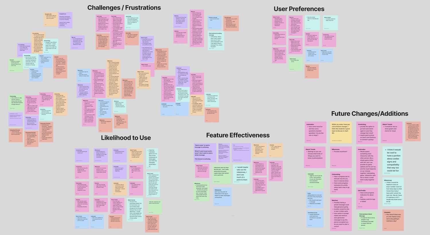
Key findings (what we acted on):
Most liked ✅: Icebreaker
Participants liked the icebreaker. It eased first-contact tension:
- "This is a fun way to interact from the beginning."
- "Makes me feel more comfortable and will help spark conversation."
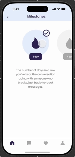
Least liked 🙅♂️: Milestones
Milestones caused the most trouble. We knew we had to rethink this:
- "Don't really understand the point."
- "Don't see the point if the app is meant to make meaningful connections."
Main confusion 😵💫: Onboarding and unmatching
Just like what we mentioned above, a major problem we found is that many users found the onboarding tutorials overwhelming and had trouble unmatching:
- “Tutorial was confusing and hard to follow, there was too much text/info right off the bat.”
- “Difficult to unmatch — would expect the unmatch button to be in the chat.”
Here are the logged issues (major, moderate, minor) in a doc. Link below:
Usability testing issues
6. Iteration and final prototype
After classifying the issues, I focused on major issues from our feedback summary with limited time, I prioritzed the issues that were most impactful to the user experience:
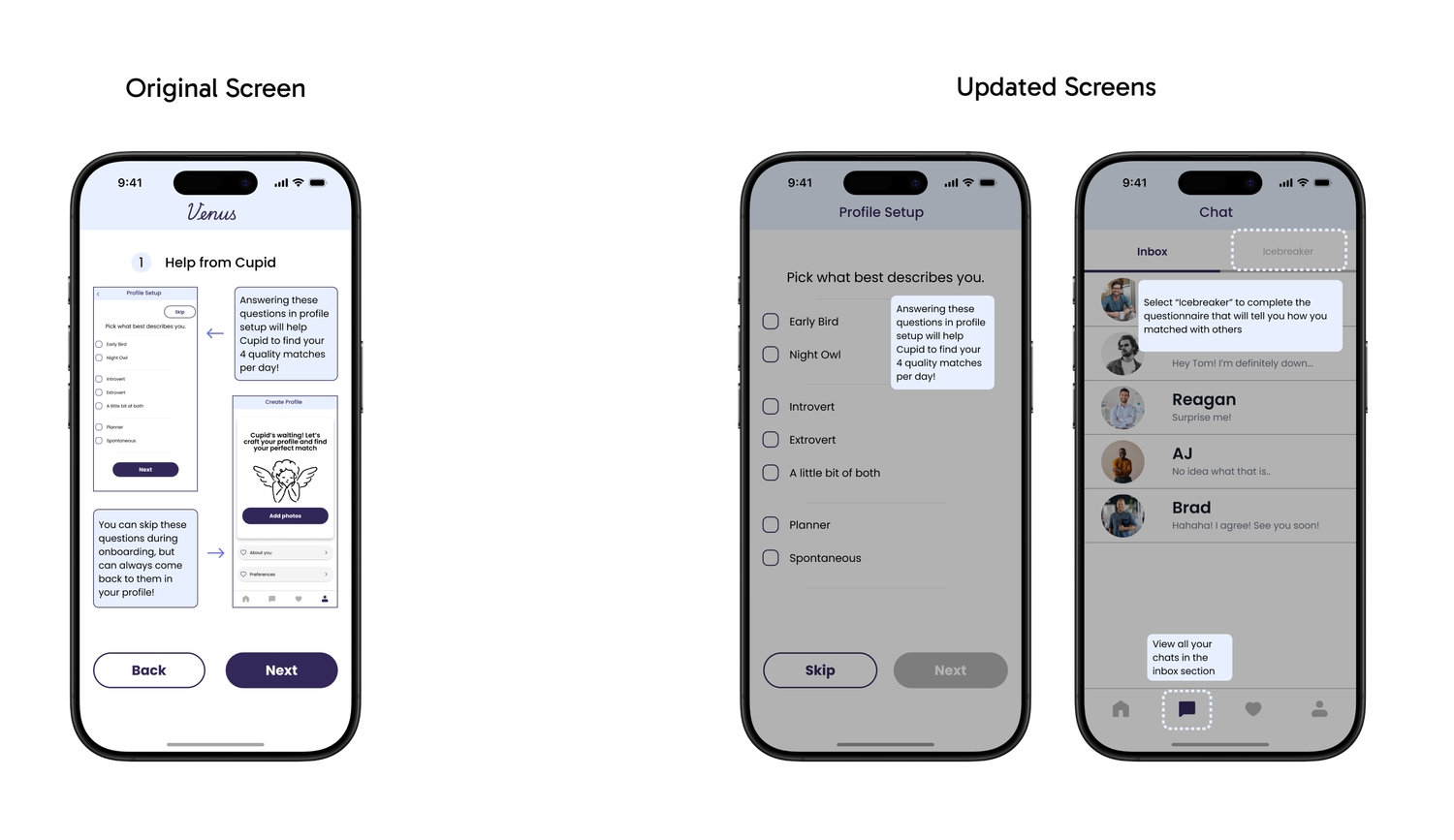
6.1 Onboarding
Issue: Too many tooltips and instruction pages at once. People couldn't take it in or use it later.
Fix: Tutorial content moved to contextual pop-ups the first time a user hits each screen. Dimmed background, one focused message and only show instructions when they're relevant.
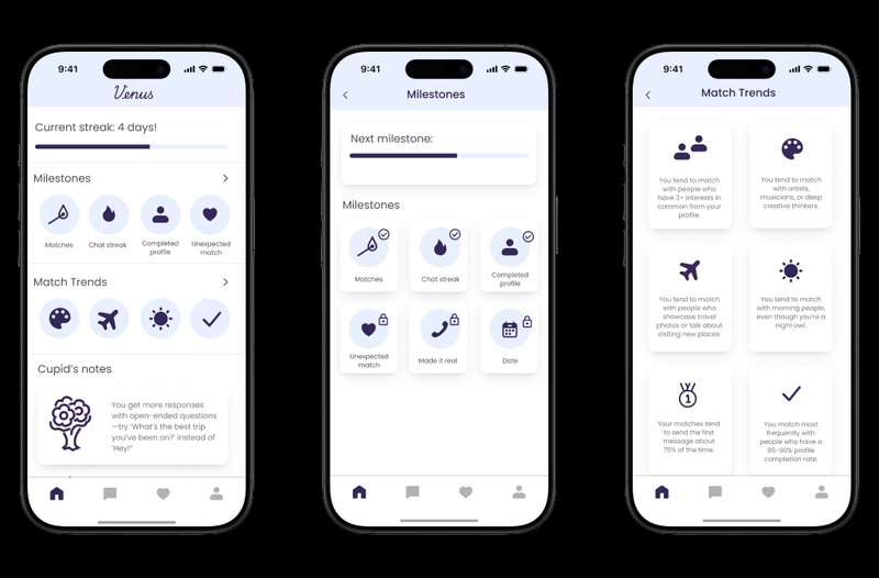
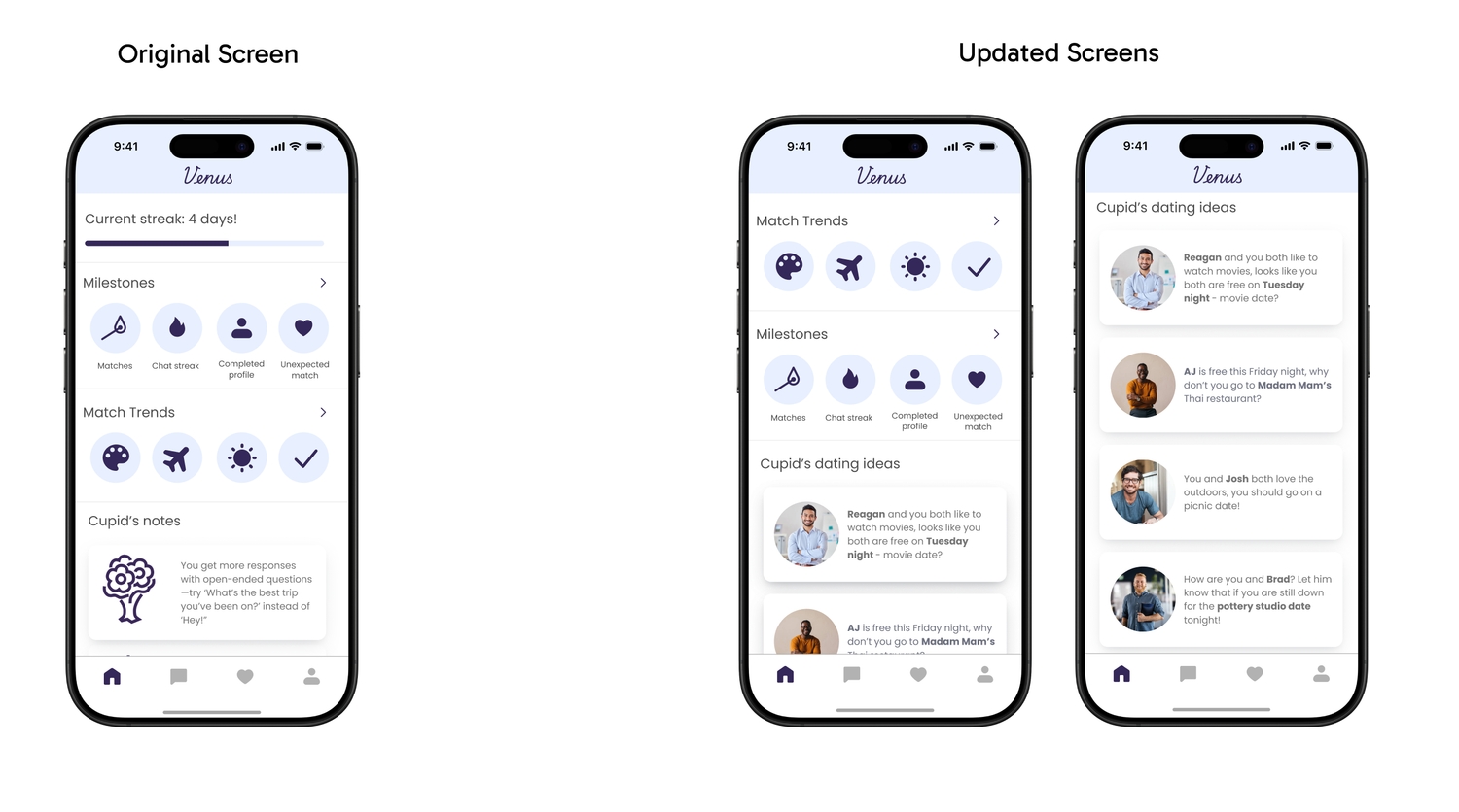
6.2 Milestones & Cupid's recommendation
Issue: People didn't get the difference between milestones and match trends, and the progress bar didn't convey useful information.
Fix: Reordered milestones, dropped the progress bar, and added "Cupid's dating ideas", where Cupid suggests date ideas (locations, availability) from ongoing conversations.
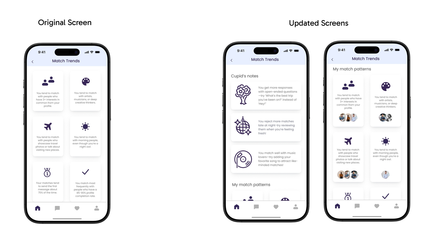
6.3 Match trends
Issue: Trends didn't feel tied to actual matches; layout felt flat.
Fix: Combined Cupid's notes with trends and added match profiles next to "my match pattern" so users can see who fits those trends.
6.4 Match profile
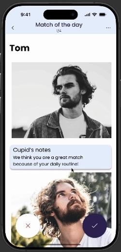
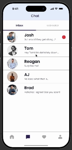
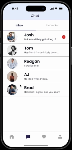
Issue: In chat, no feedback when tapping a match (e.g. Tom), and no way to unmatch after a conversation started.
Fix: Tapping a match's profile picture opens their full profile. Additionally, unmatching is available from that profile page (see second GIF).
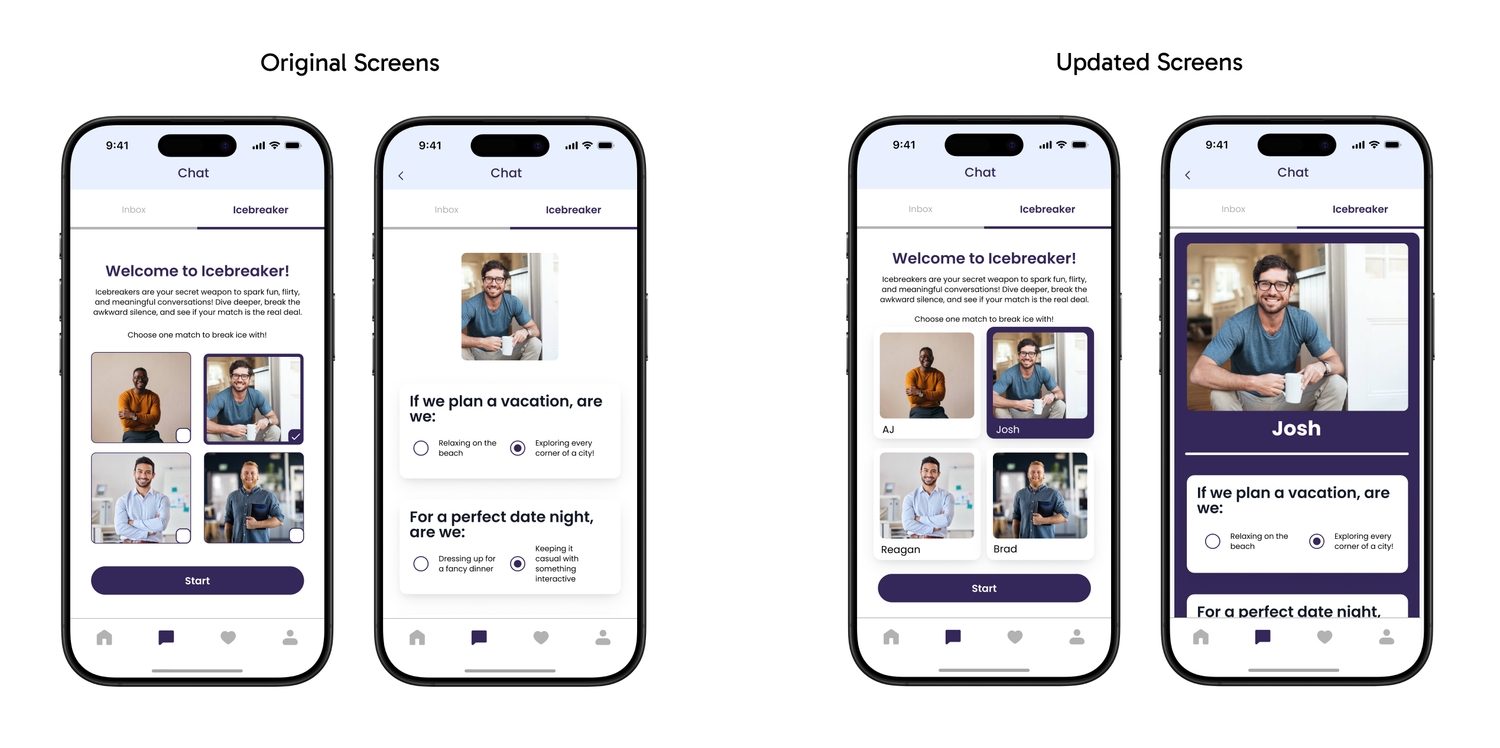
6.5 Icebreaker
Issue: No names on match images. People couldn't tell who was who. Unclear if results went to the match or if they had to message after.
Fix: Profile cards match “Today's match” style-names below the photo. Questionnaire section redesigned to be visually distinct from chat.
Transition between icebreaker screens:
After this round of iteration, I finalized the hi-fi prototype and the flows for our product by adding the conditional logic and all sorts of microanimations. Here is the final prototype, and hope you will give it a spin! (Either the link or the embedded version below)
Final prototype
7. Future plans and my learnings
7.1 Future plans
- 1. Conduct more usability testings, wider range of participants, more comprehensive.
- 2. Making Cupid more integrated to the app, providing shortcut to making reservations and block out your calendar.
- 3. Cupid to suggest safety tips, and help you recognize unhealthy conversations or signs.
- 4. Continue the ongoing design and content iteration.
7.2 My learnings
- 1. Collaborating with teammates is challenging but rewarding.
Different backgrounds and experience levels meant we had to work at understanding each other. What made us work: clear ownership, good communication, and leaning on each other's strengths. - 2. Be open-minded with opinions.
Originally,I pushed for dark green as our primary color, but the team preferred ice blue. We went with ice blue, and users liked it. Letting go of that preference was the right call. - 3. Prioritize when time is limited.
We couldn't build everything we imagined. Focusing on the most important features and iterating from feedback helped us ship something usable and learn from it.
Thanks for reading. I hope you enjoyed the project!